
James Ansell
Executive Digital Experience Director at Publicis Worldwide
We love Sarah at Publicis, we are always asking for her to return when support is needed. She is thorough when we work through UX, visual design, prototypes and graphic design, and Sarah has a natural habit of designing for the right users. Above all, Sarah is a lovely human and is a welcome addition to any team. Sarah feels like a part of the Publicis family and we will always welcome her back.

Paralympics Australia Website
Role UX & Visual Designer
Platform Browser & Mobile
In June, with the Paris Paralympics fast approaching, I was brought in by Publicis to help refresh the official Australian Paralympics website. A completely new site is in the talks, but for now – due to time constraints – a quick refresh of the existing WordPress site was all that’s possible.
The whole AI was refreshed, but my main focus was on designing the Paris 2024 Hub and all of the pages it would link to:
News Hub
Paralympians Hub
Para-sports Hub
Schedule
Parlympian Profiles
Para-sport Profiles
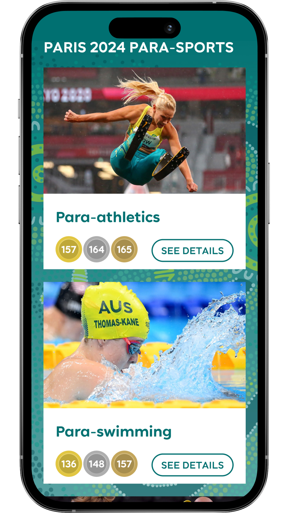
Paralympics Australia Website - Paris 2024 Hub
New Features
We added new features such as the ‘Medal Table’ module that lives on the homepage and clicks through to a full table with all the results.
Also, once the Paralympics were on, the ‘Australia Next Competing’ module replaced the countdown on the homepage to show Aussies when they could next cheer on
The old schedule page was difficult to digest, so I paid a lot of attention to making this table with a lot of information in it clear and easily scanable.
Accessibility was a key focus, so the main drop-down menu was changed from on hover to an on-click state, making the site much easier for people with disabilities to navigate.


Paris 2024 Hub
Pre Games Countdown - Paris Hub Home Page
Games Commenced - Schedule Page
Paralympians Hub Page
Para-sports Hub Page
Paralympian Profile Pages
Para-sport Profile Pages
Mobile Responsive


Swimming Australia Website
Role UX & Visual Designer
Platform Browser & Mobile
The old Swimming Australia site had 99% of visitor traffic filtering through 1% of the site’s content. So we completely reimagined the user experience, ensuring the 1% was engaging, valuable and easy to navigate.
The project had already kicked off when I started at Publicis Worldwide, so I quickly had to get up to speed with the IA. Thrown in the deep end you might say! A lot of the housekeeping had already been done – whittling the site down from 200 pages to 150.
The deadline was tight as the site had to be live for Duel in the Pool in August – all page designs had to be completed in just a few weeks. So to save on development time we identified a limited number of reusable templates that would be required to build the entire site.
The new site received 1 million monthly views and a 25% uplift in organic traffic.
Swimming Australia - Dolphin’s Hub
MVP Site Map
Templates

Design System
In Figma (I ♥️ FIGMA!) we created the design system that would be implemented across the site. Everything was set up using Components, Auto Layout, Text Styles, Colour Styles etc. to ensure we could create pages quickly and update changes easily.
Medal Tally page
Events page
Dolphin Profile page
Contact page
Mobile Responsive


Swimming Australia Navigation on Desktop and Mobile
Navigation Prototypes
The Swimming Australia site’s structure was quite complex so we decided it warranted a ‘Mega Nav’ on desktop and a dual-column nav on mobile. To ensure that the navigation design pattern would be user-friendly and to help explain the concept and interactions to the developers I created prototypes in Figma.